Paint Colour Selection Tips
Choosing a colour is rarely about the colour on its own. Light, orientation, the furniture already in the room and the feeling you want when you walk in all pull the decision one way or another. Here is how we think it through with our customers.
Natural Light
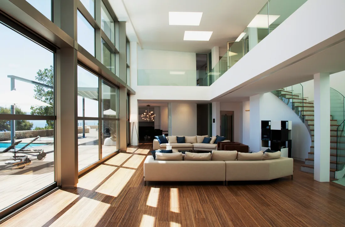
Understanding the natural light in your space is an important starting point. Light has the biggest impact on how colour is perceived in your home. The amount of light your space gets, the direction of your light source, as well as the context of existing colours in the space—rugs and furniture—can actually alter how colours appear. This is especially true with whites and neutrals, which tend to reflect any other colours present in and around your space. Bright, clean natural light will show colour in its truest form, while southern light, for example, tends to take on a warmer tone.
Considering the Space
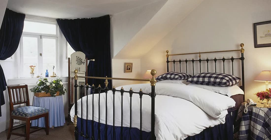
If you’re looking to make a small space feel larger, brighter colours will reflect more natural light and help open up the space. You also want to consider the other colours that are already prominent in the space so that your paint colour choice feels coordinated. Next you’ll want to think about the vibe you want to create. Do you want to make your space feel cosy? If so try a deeper, moodier option. Finally, from a designer’s point of view, architecture is also really important. A modern space will lend itself well to clean, cool colours whereas classic colours may feel more at home in a more traditional space.

Bold Colours?
If you’re not confident with a bolder choice, definitely start with a more subtle dose of colour. Softer colours are a great stepping stone to adding colour to the home. One great option is a pale, airy blue that is really easy on the eyes and has a very calming vibe. Also worth a look is a pale, barely-there pink that we like to call a new neutral. It coordinates well with lots of other colours and feels very sophisticated.

Whites
The key to getting whites right is definitely understanding your lighting and how you want the space to feel. A clean or cooler white looks great for a more modern look, whereas warmer whites have a more classic feel. You also want to think about balancing out the natural light in your space. If your space faces north, for example, the light is going to be a lot cooler, so a warmer white might be a nice choice to liven it up. A south-facing room will have warm, sunny light, so a cooler white is a nice option to keep the warmth from feeling too saturated.